swilerp
  • Home
  • Retail
  • Inventory Management
  • GST
  • POS Operations
No Result
View All Result
Get Started
swilerp
  • Home
  • Retail
  • Inventory Management
  • GST
  • POS Operations
No Result
View All Result
Get Started
swilerp
No Result
View All Result

Professional Invoice Design Secrets That Make You Look Bigger Than You Are

Tavishi Mathur by Tavishi Mathur
Jun 10, 2025
in Accounting
Reading Time: 7 mins read
0
A clean and well-structured example of professional invoice design featuring clear sections and branding.

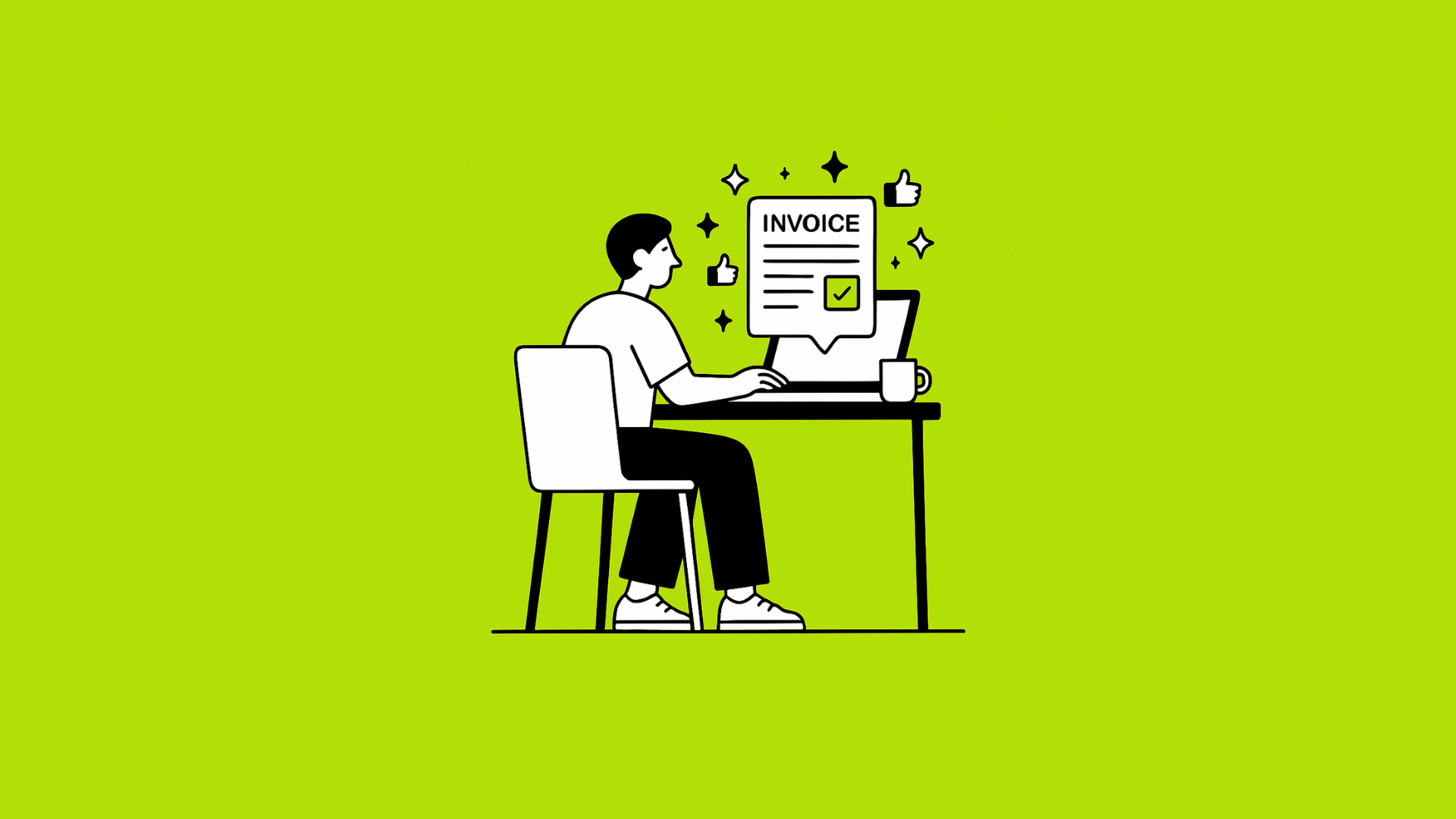
Your invoice is more than a bill—it’s a brand touchpoint. A well-designed invoice conveys professionalism, builds trust, and even encourages faster payment. This guide reveals eight secrets you can apply today to achieve professional invoice design that makes your small business look like a national chain—even if you’re just two people in a garage.

1. Keep Your Branding Front and Center for Professional Invoice Design

The first step in professional invoice design is to ensure that your logo, colors, and typography are consistently applied to reinforce brand recognition.

You might also like

Illustration of a man wearing glasses using a laptop, displayed against a bright green background. The laptop screen shows financial icons including a rupee symbol (₹), a checkmark, pie chart, bar chart, and plus-minus signs, representing financial data and analysis.

How to Read a Trial Balance in ERP Without Being a CA

May 29, 2025
Your Guide to Small Business Accounting

Your Guide to Small Business Accounting

Sep 7, 2024

Why it matters: Your logo, colors, and typography reinforce brand recognition.

How to do it:

  • Place your logo at the top in clear, high-resolution form.
  • Use your brand’s primary color for headings or accents.
  • Pick one or two legible, modern fonts (e.g., sans-serif for headings, serif for body).

2. Prioritize Clarity Over Clutter

Prioritizing clarity over clutter is paramount for professional invoice design, as a clean layout speeds understanding and reduces payment delays.

Why it matters: A clean layout speeds understanding and reduces payment delays.

How to do it:

  • Whitespace is your friend: Let elements breathe.
  • Logical sections: Group “Bill To,” “Invoice Details,” “Line Items,” and “Totals” into clear boxes or lanes.
  • Consistent alignment: Left-align text for readability; right-align numbers for quick scanning.

3. Strategic Use of Color

Why it matters: Color guides the eye to key information, like due dates or totals.

How to do it:

  • Highlight the “Total Amount Due” in your brand’s accent color.
  • Use a lighter shade to tint background rows, improving line‑item legibility.
  • Reserve red only for overdue or past‑due notices.

4. Hierarchy Through Typography

Why it matters: Hierarchy helps readers know what to read first, next, and last.

How to do it:

  • Headings (e.g., Invoice Number, Due Date): 14–16 pt bold.
  • Body text: 10–12 pt regular.
  • Totals: 18–20 pt bold.
  • Use a larger size or weight only for your most important figures.

5. Smart Line Item Layout

Why it matters: Detailed services or products become easy to scan and verify.

How to do it:

  • Columns: Date | Description | Quantity | Unit Price | Line Total.
  • Sticky headers: If the list runs long, freeze the header row so users always know what each column means.
  • Alternating row colors: Light grey on every other row aids tracking across the page.

6. Simple Yet Complete Footer

Why it matters: Your footer is the last thing a client sees—use it wisely.

How to do it:

  • Payment instructions: Bank details, UPI IDs, or payment portal links in clear bullets.
  • Terms & Conditions: One-sentence payment terms (e.g., “Payment due within 15 days of invoice date”).
  • Contact Info: Support email or phone in case of queries.

7. Incorporate Trust Elements

Why it matters: Small businesses earn confidence with social proof and security cues.

How to do it:

  • Testimonials snippet: A brief client quote in the footer or sidebar.
  • Certifications or memberships: Display small icons (e.g., ISO-certified, Chamber of Commerce member).
  • Secure payment badge: If you use a recognized payment gateway, include its logo.

8. Mobile‑Friendly PDF and HTML Versions

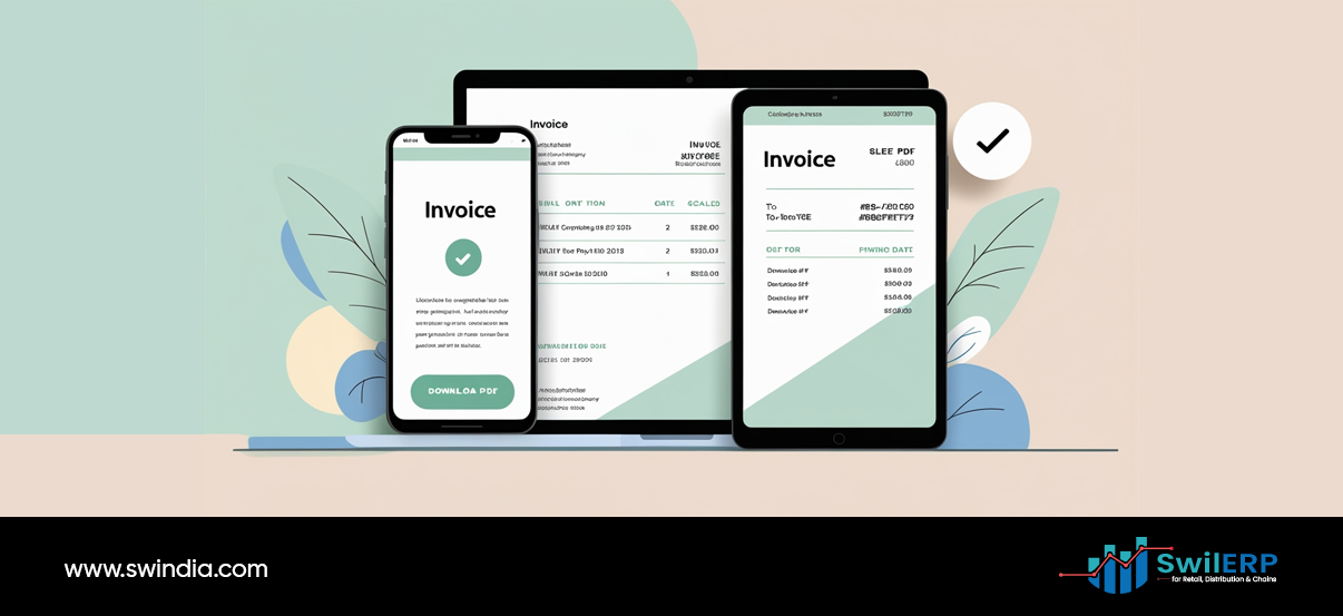
Why it matters: Many clients view invoices on phones or tablets.

How to do it:

  • Responsive design: Ensure your HTML invoice adjusts columns for narrow screens.
  • Readable font sizes: Never go below 10 pt on mobile.
  • Clickable links: Make email, website, and payment links tappable.

Putting It All Together

  1. Choose a template—or create one—in your ERP or billing software.
  2. Apply your colors and fonts consistently across all sections.
  3. Test on desktop and mobile to confirm readability.
  4. Send a sample to a colleague or friend for quick feedback.
  5. Finalize and automate—set it as your default invoice layout.

Why It Pays to Look Bigger

  • Faster approvals: Professional design speeds internal client sign‑off.
  • Reduced disputes: Clarity reduces questions about line items.
  • On‑time payments: Clear due dates and payment options boost cash flow.
  • Brand reinforcement: Every invoice is a subtle marketing touchpoint.

Your invoices can do more than collect money—they can impress customers and strengthen your brand. With these design secrets, your small operation will radiate the professionalism of a much larger enterprise—no extra hires or big budgets required. Go ahead—revamp your invoice today and watch the impact.

Share234Tweet146Pin53
Previous Post

Why Manual Sales Reports Always Lie — And What ERP Shows Instead

Next Post

ERP Diaries: 4 Essential ERP Features You’ll Use Daily (And 3 You’ll Regret Ignoring)

Tavishi Mathur

Tavishi Mathur

Tavishi Mathur is a content writer for SWIL. With a background in journalism and mass communication, she loves researching and writing about innovations in retail, wholesale, supply chain management, and international trade

Related Stories

Illustration of a man wearing glasses using a laptop, displayed against a bright green background. The laptop screen shows financial icons including a rupee symbol (₹), a checkmark, pie chart, bar chart, and plus-minus signs, representing financial data and analysis.

How to Read a Trial Balance in ERP Without Being a CA

by Tavishi Mathur
May 29, 2025
0

A trial balance can look intimidating: columns of debits and credits, ledger codes, and subtotals. But if you run or...

Your Guide to Small Business Accounting

Your Guide to Small Business Accounting

by Tavishi Mathur
Sep 7, 2024
0

Small business accountants are responsible for monitoring, documenting, and evaluating a company's financial activities. Accounting procedures provide the framework for...

The Ultimate Guide to Multi-store Accounting: Benefits, Challenges, and Solutions

The Ultimate Guide to Multi-store Accounting: Benefits, Challenges, and Solutions

by Tavishi Mathur
Aug 12, 2024
0

 A. Definition of multi-store accounting  Multi-store accounting is a financial management approach that allows businesses with multiple locations or sales...

Top-Invoice-Discounting-Platforms-in-India

Top Invoice Discounting Platforms in India

by Tavishi Mathur
Mar 30, 2024
0

Imagine you run a business and have outstanding invoices from your customers. These invoices represent money you're owed, but until...

Next Post
An open book with blank lined pages sits at the bottom of the image, with the left page appearing in light green and the right page in soft pink. Above the book, various business and academic icons float in circular bubbles, including charts and graphs, documents, a lightbulb with gears, a calculator, an umbrella, a funnel, and other symbols representing knowledge, data analysis, and learning. Small decorative elements like stars, arrows, and geometric shapes are scattered throughout the background in soft pastel colors. The illustration represents the concept of knowledge emerging from books or educational content being transformed into practical business applications and insights.

ERP Diaries: 4 Essential ERP Features You’ll Use Daily (And 3 You’ll Regret Ignoring)

Leave a Reply Cancel reply

Your email address will not be published. Required fields are marked *

Table of Contents
  • 1. Keep Your Branding Front and Center for Professional Invoice Design
  • 2. Prioritize Clarity Over Clutter
  • 3. Strategic Use of Color
  • 4. Hierarchy Through Typography
  • 5. Smart Line Item Layout
  • 6. Simple Yet Complete Footer
  • 7. Incorporate Trust Elements
  • 8. Mobile‑Friendly PDF and HTML Versions
  • Putting It All Together
SWIL Blog

Thousands of Retailers, Distributors & Chain stores use SWIL Software to organize their inventory, record their billing & manage their accounting.

  • Home
  • Retail
  • Inventory Management
  • GST
  • POS Operations
Get Started